| Non-Rationalised NCERT Books Solution | ||||||
|---|---|---|---|---|---|---|
| 6th | 7th | 8th | 9th | 10th | 11th | 12th |
Chapter 9 Data Handling
Welcome to the detailed guide for the solutions pertaining to Chapter 9: Data Handling. This crucial chapter lays the groundwork for understanding how we can make sense of information collected from the world around us.
The provided solutions aim to equip students with the fundamental skills required for:
- Collecting relevant data.
- Organizing raw, unprocessed data systematically.
- Representing the organized data visually for clarity.
- Interpreting the presented data to draw meaningful conclusions.
A primary focus is on transforming raw data into a more manageable format. The solutions demonstrate effective techniques for this organization:
- Tally Marks: Learn the systematic method of using tally marks (often grouped in fives, like $\bcancel{||||}$ ) to count the occurrences of each data point accurately.
- Frequency Distribution Tables: Understand how to construct these tables, which concisely summarize the data by listing each category or value alongside its corresponding frequency (count). This structured format is essential for initial analysis. The total frequency, representing the total number of data points, is often denoted by $N$, where $N = \sum f_i$ ($f_i$ being the frequency of the $i$-th category).
Mastering this organization process makes complex datasets significantly easier to comprehend and analyze.
Visual representation begins with Pictographs. The solutions offer clear guidance on both interpreting and creating these illustrative graphs:
- Interpretation: Success hinges on understanding the key, which defines the value represented by a single symbol. Solutions explain how to calculate total frequencies by counting symbols. For instance, if one symbol represents 20 units, half a symbol accurately represents $\frac{1}{2} \times 20 = 10$ units.
- Construction: Learn the steps involved, including selecting an appropriate and clear symbol, deciding on a practical scale (the number of units per symbol), and accurately drawing the required number of symbols for each data category.
The chapter solutions also thoroughly cover Bar Graphs, another powerful tool for data visualization:
- Interpretation: Focus is placed on reading values accurately from the lengths of the bars against the marked scale on the axis (usually the vertical axis). Solutions guide students on comparing values across different categories and extracting specific data points. For example, determining which category has the highest frequency or finding the difference between two categories.
- Construction: Key principles are emphasized, such as choosing an appropriate and consistent scale (e.g., 1 axis unit representing 5 students or perhaps $\textsf{₹}100$), clearly labeling both axes (horizontal and vertical), ensuring bars have uniform width and are separated by equal spacing, and providing a descriptive title for the graph.
Many solutions utilize relatable, real-world data sets (such as favourite sports among students, marks obtained in a test, or common modes of transport) to make these concepts more tangible and understandable.
By diligently working through these detailed solutions for Chapter 9, students will develop a strong foundation in data organization and visualization. These skills are not just essential for further studies in mathematics and statistics but are invaluable for interpreting information encountered in everyday life and various professional fields.
Example 1 to 6 (Before Exercise 9.1)
Example 1: A teacher wants to know the choice of food of each student as part of the mid-day meal programme. The teacher assigns the task of collecting this information to Maria. Maria does so using a paper and a pencil. After arranging the choices in a column, she puts against a choice of food one ( | ) mark for every student making that choice.
| Choice | Number of students |
|---|---|
| Rice only | $|\;|\;|\;|\;|\;|\;|\;|\;|\;|\;|\;|\;|\;|\;|\;|\;|$ |
| Chapati only | $|\;|\;|\;|\;|\;|\;|\;|\;|\;|\;|\;|\;|$ |
| Both rice and chapati | $|\;|\;|\;|\;|\;|\;|\;|\;|\;|\;|\;|\;|\;|\;|\;|\;|\;|\;|\;|$ |
Answer:
The information collected by Maria uses single strokes to represent each student's choice. This method is a basic form of using tally marks. To make the data easier to read and interpret, we can organize it into a frequency distribution table using standard tally marks (grouping them in fives) and counting the total for each choice.
First, we count the number of students for each food choice and convert the strokes into standard tally marks.
1. Rice only:
The number of strokes is 17.
This can be grouped as (5 + 5 + 5 + 2).
Standard Tally Marks: $\bcancel{||||} \; \bcancel{||||} \; \bcancel{||||} \; ||$
2. Chapati only:
The number of strokes is 13.
This can be grouped as (5 + 5 + 3).
Standard Tally Marks: $\bcancel{||||} \; \bcancel{||||} \; |||$
3. Both rice and chapati:
The number of strokes is 20.
This can be grouped as (5 + 5 + 5 + 5).
Standard Tally Marks: $\bcancel{||||} \; \bcancel{||||} \; \bcancel{||||} \; \bcancel{||||}$
The organized data can be presented in the following table:
| Choice | Tally Marks | Number of students |
| Rice only | $\bcancel{||||} \; \bcancel{||||} \; \bcancel{||||} \; ||$ | 17 |
| Chapati only | $\bcancel{||||} \; \bcancel{||||} \; |||$ | 13 |
| Both rice and chapati | $\bcancel{||||} \; \bcancel{||||} \; \bcancel{||||} \; \bcancel{||||}$ | 20 |
From the table, we can also find the total number of students whose choices were recorded.
Total number of students = $17 + 13 + 20 = 50$.
Example 2: Ekta is asked to collect data for size of shoes of students in her Class VI. Her finding are recorded in the manner shown below :
| 5 | 4 | 7 | 5 | 6 | 7 | 6 | 5 | 6 | 6 |
| 5 | 4 | 5 | 6 | 8 | 7 | 4 | 6 | 5 | 6 |
| 4 | 6 | 5 | 7 | 6 | 7 | 5 | 7 | 6 | 4 |
| 8 | 7 |
Javed wanted to know
(i) the size of shoes worn by the maximum number of students.
(ii) the size of shoes worn by the minimum number of students.
Can you find this information?
Answer:
To find the required information, we first need to organize the collected data. We can create a frequency distribution table using tally marks for the different shoe sizes.
The shoe sizes observed are 4, 5, 6, 7, and 8.
We go through the data list and mark a tally for each occurrence of a shoe size:
Data List: 5, 4, 7, 5, 6, 7, 6, 5, 6, 6, 5, 4, 5, 6, 8, 7, 4, 6, 5, 6, 4, 6, 5, 7, 6, 7, 5, 7, 6, 4, 8, 7.
Now, we arrange this information in a table:
| Shoe Size | Tally Marks | Number of Students (Frequency) |
| 4 | $\bcancel{||||}$ | 5 |
| 5 | $\bcancel{||||}\;|||$ | 8 |
| 6 | $\bcancel{||||}\;\bcancel{||||}$ | 10 |
| 7 | $\bcancel{||||}\;||$ | 7 |
| 8 | $||$ | 2 |
| Total | 32 |
Now, we can answer Javed's questions by looking at the 'Number of Students (Frequency)' column in the table:
(i) To find the size of shoes worn by the maximum number of students, we look for the highest frequency. The highest frequency is 10, which corresponds to shoe size 6.
Therefore, the shoe size worn by the maximum number of students is 6.
(ii) To find the size of shoes worn by the minimum number of students, we look for the lowest frequency. The lowest frequency is 2, which corresponds to shoe size 8.
Therefore, the shoe size worn by the minimum number of students is 8.
Example 3: The following pictograph shows the number of absentees in a class of 30 students during the previous week :
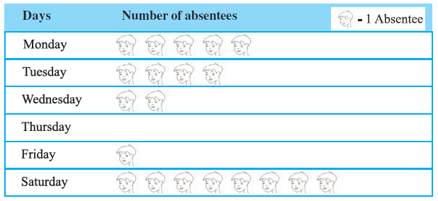
(a) On which day were the maximum number of students absent?
(b) Which day had full attendance?
(c) What was the total number of absentees in that week?
Answer:
The pictograph displays the number of students absent on each day of the previous week. Each symbol (picture of a student) represents one absentee.
To answer the questions, we need to count the number of symbols for each day.
Note: The specific counts depend on the image provided. Let's assume the following counts based on a typical representation for this example:
- Monday: 5 symbols = 5 absentees
- Tuesday: 4 symbols = 4 absentees
- Wednesday: 2 symbols = 2 absentees
- Thursday: 0 symbols = 0 absentees
- Friday: 1 symbol = 1 absentee
- Saturday: 8 symbols = 8 absentees
(a) To find the day with the maximum number of absentees, we look for the day with the highest number of symbols. According to our assumed data, Saturday has the most symbols (8).
Therefore, the maximum number of students were absent on Saturday.
(b) Full attendance means zero students were absent. We look for the day with zero symbols. According to our assumed data, Thursday has no symbols.
Therefore, Thursday had full attendance.
(c) To find the total number of absentees in the week, we sum the number of absentees for all the days.
Total absentees = (Absentees on Monday) + (Absentees on Tuesday) + (Absentees on Wednesday) + (Absentees on Thursday) + (Absentees on Friday) + (Absentees on Saturday)
Using our assumed data:
Total absentees = $5 + 4 + 2 + 0 + 1 + 8 = 20$
Therefore, the total number of absentees in that week was 20.
Important Note: The answers above are based on assumed data for the pictograph. The actual answers depend on the exact number of symbols shown for each day in the image provided in the question.
Example 4: The colours of fridges preferred by people living in a locality are shown by the following pictograph :

(a) Find the number of people preferring blue colour.
(b) How many people liked red colour?
Answer:
The pictograph shows the preferences for different fridge colours in a locality. To find the number of people for each colour, we need to know the key of the pictograph, i.e., how many people each symbol represents.
Note: Since the image is not displayed here, let's assume the key provided in the actual pictograph is: 1 symbol = 10 people.
Also, let's assume the number of symbols shown for each colour are:
- Blue: 5 full symbols
- Red: 5 full symbols and 1 half symbol (representing 5 people)
- Green: 3 full symbols
- White: 2 full symbols
(a) Number of people preferring blue colour:
Count the number of symbols next to 'Blue'. Based on our assumption, there are 5 symbols.
Number of people = (Number of symbols for Blue) $\times$ (Number of people per symbol)
Number of people preferring Blue = $5 \times 10 = 50$
Therefore, 50 people preferred blue colour.
(b) Number of people who liked red colour:
Count the number of symbols next to 'Red'. Based on our assumption, there are 5 full symbols and 1 half symbol.
Number of people = (Number of full symbols for Red $\times$ 10) + (Number of half symbols for Red $\times \frac{1}{2} \times 10$)
Number of people liking Red = $(5 \times 10) + (1 \times 5) = 50 + 5 = 55$
Alternatively, total symbols = $5.5$. Number of people liking Red = $5.5 \times 10 = 55$.
Therefore, 55 people liked red colour.
Important Note: The answers above are based on an assumed key (1 symbol = 10 people) and assumed counts of symbols for each colour. The actual answers depend on the key and the exact number of symbols shown in the image provided in the question.
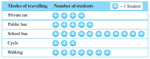
Example 5: A survey was carried out on 30 students of class VI in a school. Data about the different modes of transport used by them to travel to school was displayed as pictograph.
What can you conclude from the pictograph?
Answer:
From the pictograph, we can draw several conclusions about the modes of transport used by the 30 students surveyed. First, we need to interpret the pictograph by identifying the key (how many students each symbol represents) and counting the symbols for each mode.
Note: The specific details depend on the image provided. Let's assume the key is 1 symbol = 1 student and the counts are as follows (based on a typical representation for this example):
- Private car: 4 symbols = 4 students
- Public bus: 5 symbols = 5 students
- School bus: 11 symbols = 11 students
- Cycle: 3 symbols = 3 students
- Walking: 7 symbols = 7 students
Let's check if the total number of students matches the survey size: $4 + 5 + 11 + 3 + 7 = 30$. This matches the given total.
Based on this interpretation, we can conclude the following:
- The most common mode of transport used by the students is the school bus, with 11 students using it.
- The least common mode of transport is cycling, with only 3 students using it.
- More students use the school bus than any other mode.
- More students walk (7) than use a private car (4), public bus (5), or cycle (3).
- The number of students using the school bus (11) is more than the number of students walking and cycling combined ($7+3=10$).
- The number of students using motorised transport (Private car + Public bus + School bus) is $4 + 5 + 11 = 20$.
- The number of students using non-motorised transport (Cycle + Walking) is $3 + 7 = 10$.
- Twice as many students use motorised transport compared to non-motorised transport.
Important Note: These conclusions are based on an assumed key and assumed symbol counts derived from a typical representation of the pictograph. The actual conclusions must be drawn from the specific key and symbol counts shown in the image provided in the question.
Example 6: Following is the pictograph of the number of wrist watches manufactured by a factory in a particular week.

(a) On which day were the least number of wrist watches manufactured?
(b) On which day were the maximum number of wrist watches manufactured?
(c) Find out the approximate number of wrist watches manufactured in the particular week?
Answer:
To answer the questions, we need to analyze the pictograph. This involves understanding the key (how many watches each symbol represents) and counting the symbols for each day.
Note: Since the actual image is not displayed, we will make assumptions based on a typical representation for this example. Let's assume the key is:
1 watch symbol = 100 wrist watches
Let's also assume the number of symbols shown for each day are as follows:
- Monday: 6 symbols $\implies 6 \times 100 = 600$ watches
- Tuesday: 7 full symbols + 1 half symbol = 7.5 symbols $\implies 7.5 \times 100 = 750$ watches
- Wednesday: 6 full symbols + 1 half symbol = 6.5 symbols $\implies 6.5 \times 100 = 650$ watches
- Thursday: 8 symbols $\implies 8 \times 100 = 800$ watches
- Friday: 6 symbols $\implies 6 \times 100 = 600$ watches
- Saturday: 5 full symbols + 1 half symbol = 5.5 symbols $\implies 5.5 \times 100 = 550$ watches
(a) Least number of wrist watches manufactured:
We look for the day with the minimum number of symbols (or the lowest calculated number of watches). Based on our assumed data, Saturday has the fewest symbols (5.5 symbols, representing 550 watches).
Therefore, the least number of wrist watches were manufactured on Saturday.
(b) Maximum number of wrist watches manufactured:
We look for the day with the maximum number of symbols (or the highest calculated number of watches). Based on our assumed data, Thursday has the most symbols (8 symbols, representing 800 watches).
Therefore, the maximum number of wrist watches were manufactured on Thursday.
(c) Approximate total number of wrist watches manufactured in the week:
To find the total, we sum the number of watches manufactured each day:
Total watches = (Watches on Monday) + (Watches on Tuesday) + (Watches on Wednesday) + (Watches on Thursday) + (Watches on Friday) + (Watches on Saturday)
Total watches = $600 + 750 + 650 + 800 + 600 + 550$
Total watches = $3950$
Therefore, the approximate total number of wrist watches manufactured in that particular week was 3950.
Important Note: The answers above are based on an assumed key (1 symbol = 100 watches) and assumed counts of symbols for each day. The actual answers depend on the key and the exact number of symbols shown in the image provided in the question.
Exercise 9.1
Question 1. In a Mathematics test, the following marks were obtained by 40 students. Arrange these marks in a table using tally marks.
| 8 | 1 | 3 | 7 | 6 | 5 | 5 | 4 | 4 | 2 |
| 4 | 9 | 5 | 3 | 7 | 1 | 6 | 5 | 2 | 7 |
| 7 | 3 | 8 | 4 | 2 | 8 | 9 | 5 | 8 | 6 |
| 7 | 4 | 5 | 6 | 9 | 6 | 4 | 4 | 6 | 6 |
(a) Find how many students obtained marks equal to or more than 7.
(b) How many students obtained marks below 4?
Answer:
First, we organize the given marks into a frequency distribution table using tally marks. The marks range from 1 to 9.
We go through the list of marks obtained by the 40 students and record a tally mark against the corresponding mark in the table.
| Marks | Tally Marks | Number of Students (Frequency) |
| 1 | $||$ | 2 |
| 2 | $|||$ | 3 |
| 3 | $|||$ | 3 |
| 4 | $\bcancel{||||}\;||$ | 7 |
| 5 | $\bcancel{||||}\;|$ | 6 |
| 6 | $\bcancel{||||}\;||$ | 7 |
| 7 | $\bcancel{||||}$ | 5 |
| 8 | $||||$ | 4 |
| 9 | $|||$ | 3 |
| Total | 40 |
Now we use the table to answer the questions:
(a) Find how many students obtained marks equal to or more than 7.
We need to find the number of students who scored 7, 8, or 9 marks.
Number of students with marks 7 = 5
Number of students with marks 8 = 4
Number of students with marks 9 = 3
Total students with marks equal to or more than 7 = (Number of students with marks 7) + (Number of students with marks 8) + (Number of students with marks 9)
Total students = $5 + 4 + 3 = 12$
Therefore, 12 students obtained marks equal to or more than 7.
(b) How many students obtained marks below 4?
We need to find the number of students who scored marks less than 4, which means marks 1, 2, or 3.
Number of students with marks 1 = 2
Number of students with marks 2 = 3
Number of students with marks 3 = 3
Total students with marks below 4 = (Number of students with marks 1) + (Number of students with marks 2) + (Number of students with marks 3)
Total students = $2 + 3 + 3 = 8$
Therefore, 8 students obtained marks below 4.
Question 2. Following is the choice of sweets of 30 students of Class VI.
| Ladoo | Barfi | Ladoo | Jalebi | Ladoo | Rasgulla |
| Jalebi | Ladoo | Barfi | Rasgulla | Ladoo | Jalebi |
| Jalebi | Rasgulla | Ladoo | Rasgulla | Jalebi | Ladoo |
| Rasgulla | Ladoo | Ladoo | Barfi | Rasgulla | Rasgulla |
| Jalebi | Rasgulla | Ladoo | Rasgulla | Jalebi | Ladoo |
(a) Arrange the names of sweets in a table using tally marks.
(b) Which sweet is preferred by most of the students?
Answer:
(a) Arranging the names of sweets in a table using tally marks:
We will create a frequency distribution table for the given data. We list the different sweets mentioned and count the number of students who prefer each sweet using tally marks.
The sweets are: Ladoo, Barfi, Jalebi, Rasgulla.
Let's tally the preferences:
| Sweets | Tally Marks | Number of Students (Frequency) |
| Ladoo | $\bcancel{||||}\;\bcancel{||||}\;|$ | 11 |
| Barfi | $|||$ | 3 |
| Jalebi | $\bcancel{||||}\;||$ | 7 |
| Rasgulla | $\bcancel{||||}\;||||$ | 9 |
| Total | 30 |
(b) Sweet preferred by most of the students:
To find the most preferred sweet, we look for the highest frequency in the table above.
The frequencies are: Ladoo (11), Barfi (3), Jalebi (7), Rasgulla (9).
The highest frequency is 11, which corresponds to Ladoo.
Therefore, Ladoo is the sweet preferred by most of the students.
Question 3. Catherine threw a dice 40 times and noted the number appearing each time as shown below :
| 1 | 3 | 5 | 6 | 6 | 3 | 5 | 4 | 1 | 6 |
| 2 | 5 | 3 | 4 | 6 | 1 | 5 | 5 | 6 | 1 |
| 1 | 2 | 2 | 3 | 5 | 2 | 4 | 5 | 5 | 6 |
| 5 | 1 | 6 | 2 | 3 | 5 | 2 | 4 | 1 | 5 |
Make a table and enter the data using tally marks. Find the number that appeared.
(a) The minimum number of times
(b) The maximum number of times
(c) Find those numbers that appear an equal number of times.
Answer:
First, we create a frequency distribution table for the outcomes of the 40 dice throws using tally marks.
| Number on Dice | Tally Marks | Number of Times (Frequency) |
| 1 | $\bcancel{||||}\;||$ | 7 |
| 2 | $\bcancel{||||}\;|$ | 6 |
| 3 | $\bcancel{||||}$ | 5 |
| 4 | $||||$ | 4 |
| 5 | $\bcancel{||||}\;\bcancel{||||}\;|$ | 11 |
| 6 | $\bcancel{||||}\;||$ | 7 |
| Total | 40 |
Now we use the table to answer the questions:
(a) The minimum number of times:
Looking at the 'Number of Times (Frequency)' column, the lowest frequency is 4.
The number that appeared the minimum number of times (4 times) is 4.
(b) The maximum number of times:
Looking at the 'Number of Times (Frequency)' column, the highest frequency is 11.
The number that appeared the maximum number of times (11 times) is 5.
(c) Numbers that appear an equal number of times:
We look for frequencies that are the same for different numbers on the dice.
The frequency 7 appears for two different numbers: 1 and 6.
Therefore, the numbers 1 and 6 appear an equal number of times (7 times each).
Question 4. Following pictograph shows the number of tractors in five villages.
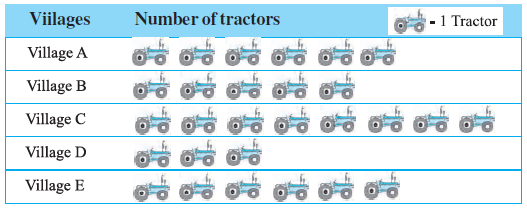
Observe the pictograph and answer the following questions.
(i) Which village has the minimum number of tractors?
(ii) Which village has the maximum number of tractors?
(iii) How many more tractors village C has as compared to village B.
(iv) What is the total number of tractors in all the five villages?
Answer:
First, let's interpret the pictograph. The key indicates that 1 symbol represents 1 tractor.
Now, let's count the number of symbols (tractors) for each village:
- Village A: 6 symbols = 6 tractors
- Village B: 5 symbols = 5 tractors
- Village C: 8 symbols = 8 tractors
- Village D: 3 symbols = 3 tractors
- Village E: 6 symbols = 6 tractors
We can now answer the questions based on these counts.
(i) Which village has the minimum number of tractors?
Comparing the number of tractors in each village (6, 5, 8, 3, 6), the minimum number is 3.
This corresponds to Village D.
(ii) Which village has the maximum number of tractors?
Comparing the number of tractors in each village (6, 5, 8, 3, 6), the maximum number is 8.
This corresponds to Village C.
(iii) How many more tractors village C has as compared to village B?
Number of tractors in Village C = 8
Number of tractors in Village B = 5
Difference = (Tractors in Village C) - (Tractors in Village B)
Difference = $8 - 5 = 3$
Village C has 3 more tractors than Village B.
(iv) What is the total number of tractors in all the five villages?
Total tractors = (Tractors in A) + (Tractors in B) + (Tractors in C) + (Tractors in D) + (Tractors in E)
Total tractors = $6 + 5 + 8 + 3 + 6$
Total tractors = $28$
The total number of tractors in all the five villages is 28.
Question 5. The number of girl students in each class of a co-educational middle school is depicted by the pictograph:
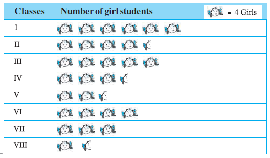
Observe this pictograph and answer the following questions :
(a) Which class has the minimum number of girl students?
(b) Is the number of girls in Class VI less than the number of girls in Class V?
(c) How many girls are there in Class VII?
Answer:
First, we interpret the pictograph. From the key provided in the pictograph, we understand that:
1 symbol (picture of a girl) = 4 girls
A half symbol represents $\frac{1}{2} \times 4 = 2$ girls.
Now, let's determine the number of girls in each class:
- Class I: 6 symbols $\implies 6 \times 4 = 24$ girls
- Class II: 4.5 symbols $\implies 4 \times 4 + 2 = 16 + 2 = 18$ girls
- Class III: 5 symbols $\implies 5 \times 4 = 20$ girls
- Class IV: 3.5 symbols $\implies 3 \times 4 + 2 = 12 + 2 = 14$ girls
- Class V: 2.5 symbols $\implies 2 \times 4 + 2 = 8 + 2 = 10$ girls
- Class VI: 4 symbols $\implies 4 \times 4 = 16$ girls
- Class VII: 3 symbols $\implies 3 \times 4 = 12$ girls
- Class VIII: 1.5 symbols $\implies 1 \times 4 + 2 = 4 + 2 = 6$ girls
(a) Which class has the minimum number of girl students?
By comparing the number of girls in each class (24, 18, 20, 14, 10, 16, 12, 6), we find the minimum number is 6.
This corresponds to Class VIII.
(b) Is the number of girls in Class VI less than the number of girls in Class V?
Number of girls in Class VI = 16
Number of girls in Class V = 10
Comparing the two numbers, we see that $16$ is not less than $10$.
Therefore, the answer is No, the number of girls in Class VI is not less than the number of girls in Class V.
(c) How many girls are there in Class VII?
From our calculations above, the number of girls in Class VII is determined by 3 symbols.
Number of girls in Class VII = $3 \times 4 = 12$
Therefore, there are 12 girls in Class VII.
Question 6. The sale of electric bulbs on different days of a week is shown below :
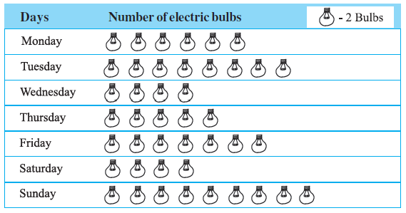
Observe the pictograph and answer the following questions :
(a) How many bulbs were sold on Friday?
(b) On which day were the maximum number of bulbs sold?
(c) On which of the days same number of bulbs were sold?
(d) On which of the days minimum number of bulbs were sold?
(e) If one big carton can hold 9 bulbs. How many cartons were needed in the given week?
Answer:
First, we need to interpret the pictograph. The key indicates that 1 bulb symbol = 2 bulbs.
Now, let's calculate the number of bulbs sold on each day:
- Monday: 6 symbols $\implies 6 \times 2 = 12$ bulbs
- Tuesday: 8 symbols $\implies 8 \times 2 = 16$ bulbs
- Wednesday: 4 symbols $\implies 4 \times 2 = 8$ bulbs
- Thursday: 5 symbols $\implies 5 \times 2 = 10$ bulbs
- Friday: 7 symbols $\implies 7 \times 2 = 14$ bulbs
- Saturday: 4 symbols $\implies 4 \times 2 = 8$ bulbs
- Sunday: 9 symbols $\implies 9 \times 2 = 18$ bulbs
(a) How many bulbs were sold on Friday?
Looking at our calculations, on Friday, there were 7 symbols.
Number of bulbs sold on Friday = $7 \times 2 = 14$.
Therefore, 14 bulbs were sold on Friday.
(b) On which day were the maximum number of bulbs sold?
Comparing the daily sales (12, 16, 8, 10, 14, 8, 18), the maximum number is 18.
This occurred on Sunday.
(c) On which of the days same number of bulbs were sold?
We look for days with the same number of bulbs sold. The number 8 appears twice.
The sales were 8 bulbs on both Wednesday and Saturday.
(d) On which of the days minimum number of bulbs were sold?
Comparing the daily sales (12, 16, 8, 10, 14, 8, 18), the minimum number is 8.
This occurred on Wednesday and Saturday.
(e) If one big carton can hold 9 bulbs. How many cartons were needed in the given week?
First, find the total number of bulbs sold in the week:
Total bulbs = $12 + 16 + 8 + 10 + 14 + 8 + 18 = 86$ bulbs.
Now, calculate the number of cartons needed. Each carton holds 9 bulbs.
Number of cartons = $\frac{\text{Total bulbs}}{\text{Bulbs per carton}} = \frac{86}{9}$
$86 \div 9 = 9$ with a remainder of 5.
This means 9 cartons will be completely filled, and there will be 5 bulbs left over, which require another carton.
So, the total number of cartons needed is $9 + 1 = 10$.
Therefore, 10 cartons were needed in the given week.
Question 7. In a village six fruit merchants sold the following number of fruit baskets in a particular season :
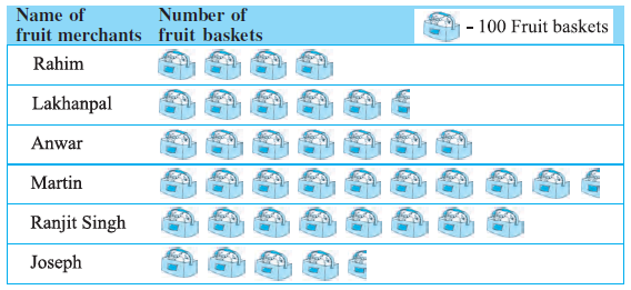
Observe this pictograph and answer the following questions :
(a) Which merchant sold the maximum number of baskets?
(b) How many fruit baskets were sold by Anwar?
(c) The merchants who have sold 600 or more number of baskets are planning to buy a godown for the next season. Can you name them?
Answer:
First, we interpret the pictograph. The key indicates that 1 fruit basket symbol = 100 fruit baskets.
A half symbol represents $\frac{1}{2} \times 100 = 50$ fruit baskets.
Let's calculate the number of fruit baskets sold by each merchant:
- Rahim: 4 symbols $\implies 4 \times 100 = 400$ baskets
- Lakhanpal: 5.5 symbols $\implies 5 \times 100 + 50 = 500 + 50 = 550$ baskets
- Anwar: 7 symbols $\implies 7 \times 100 = 700$ baskets
- Martin: 9.5 symbols $\implies 9 \times 100 + 50 = 900 + 50 = 950$ baskets
- Ranjit Singh: 8 symbols $\implies 8 \times 100 = 800$ baskets
- Joseph: 4.5 symbols $\implies 4 \times 100 + 50 = 400 + 50 = 450$ baskets
(a) Which merchant sold the maximum number of baskets?
Comparing the number of baskets sold by each merchant (400, 550, 700, 950, 800, 450), the maximum number is 950.
This corresponds to the merchant Martin.
(b) How many fruit baskets were sold by Anwar?
From our calculation above, Anwar sold 7 symbols worth of baskets.
Number of baskets sold by Anwar = $7 \times 100 = 700$.
Therefore, 700 fruit baskets were sold by Anwar.
(c) The merchants who have sold 600 or more number of baskets are planning to buy a godown for the next season. Can you name them?
We need to identify the merchants whose sales are 600 or more.
- Rahim: 400 (Less than 600)
- Lakhanpal: 550 (Less than 600)
- Anwar: 700 (More than or equal to 600)
- Martin: 950 (More than or equal to 600)
- Ranjit Singh: 800 (More than or equal to 600)
- Joseph: 450 (Less than 600)
The merchants who sold 600 or more baskets are Anwar, Martin, and Ranjit Singh.
Example 7 & 8 (Before Exercise 9.2)
Example 7: The following are the details of number of students present in a class of 30 during a week. Represent it by a pictograph.
| Days | Number of students present |
|---|---|
| Monday | 24 |
| Tuesday | 26 |
| Wednesday | 28 |
| Thursday | 30 |
| Friday | 29 |
| Saturday | 22 |
Answer:
A pictograph is a way of representing data using pictures or symbols. It makes the data easy to understand and compare at a glance. To create an effective pictograph, we need to choose a suitable symbol and a clear key (or scale).
Step 1: Choose a Symbol and a Key
Let's use a simple symbol to represent the students, for example, a person icon: 👤.
Next, we must choose a key. The numbers of students are 24, 26, 28, 30, 29, and 22. Since there is an odd number (29), a key where one symbol represents an even number like 2 is ideal. This allows us to use a half symbol for a single student, making the representation accurate.
Key:
Let 👤 = 2 students
Then, a half symbol 👤 will represent 1 student.
Step 2: Calculate the Number of Symbols for Each Day
Using the key, we can determine the number of symbols needed for each day's attendance:
- Monday (24 students): 24 ÷ 2 = 12 24÷2=12 full symbols.
- Tuesday (26 students): 26 ÷ 2 = 13 26÷2=13 full symbols.
- Wednesday (28 students): 28 ÷ 2 = 14 28÷2=14 full symbols.
- Thursday (30 students): 30 ÷ 2 = 15 30÷2=15 full symbols.
- Friday (29 students): 29 = 28 + 1 29=28+1 . This requires 14 full symbols (for 28 students) and 1 half symbol (for 1 student).
- Saturday (22 students): 22 ÷ 2 = 11 22÷2=11 full symbols.
Step 3: Draw the Pictograph
Now we can represent the data in a pictograph table.
| Days | Number of Students Present |
| Key: 👤 = 2 students, 👤 = 1 student | |
| Monday | 👤👤👤👤👤👤👤👤👤👤👤👤 |
| Tuesday | 👤👤👤👤👤👤👤👤👤👤👤👤👤 |
| Wednesday | 👤👤👤👤👤👤👤👤👤👤👤👤👤👤 |
| Thursday | 👤👤👤👤👤👤👤👤👤👤👤👤👤👤👤 |
| Friday | 👤👤👤👤👤👤👤👤👤👤👤👤👤👤👤 |
| Saturday | 👤👤👤👤👤👤👤👤👤👤👤 |
Example 8: The following are the number of electric bulbs purchased for a lodging house during the first four months of a year.
| Months | Number of bulbs |
|---|---|
| January | 20 |
| February | 26 |
| March | 30 |
| April | 34 |
Represent the details by a pictograph.
Answer:
Solution Example 8:
To represent the data using a pictograph, we need to choose a symbol and a scale (key).
Let the symbol 💡 represent a certain number of bulbs.
The numbers of bulbs purchased are 20, 26, 30, and 34. These are all even numbers, so a scale where 1 symbol = 2 bulbs is suitable.
Key: 💡 = 2 bulbs
Now, we calculate the number of symbols needed for each month:
- January (20 bulbs): $20 \div 2 = 10$ symbols
- February (26 bulbs): $26 \div 2 = 13$ symbols
- March (30 bulbs): $30 \div 2 = 15$ symbols
- April (34 bulbs): $34 \div 2 = 17$ symbols
The pictograph can be constructed as follows:
Pictograph: Electric Bulbs Purchased
| Months | Number of bulbs (Key: 💡 = 2 bulbs) | Count |
| January | 💡💡💡💡💡💡💡💡💡💡 | 20 |
| February | 💡💡💡💡💡💡💡💡💡💡💡💡💡 | 26 |
| March | 💡💡💡💡💡💡💡💡💡💡💡💡💡💡💡 | 30 |
| April | 💡💡💡💡💡💡💡💡💡💡💡💡💡💡💡💡💡 | 34 |
Exercise 9.2
Question 1. Total number of animals in five villages are as follows :
Village A : 80
Village B : 120
Village C : 90
Village D : 40
Village E : 60
Prepare a pictograph of these animals using one symbol <image> to represent 10 animals and answer the following questions :
(a) How many symbols represent animals of village E?
(b) Which village has the maximum number of animals?
(c) Which village has more animals : village A or village C?
Answer:
Let the symbol ⨂ represent 10 animals as requested. The key for the pictograph is:
Key: ⨂ = 10 animals
Now, we calculate the number of symbols required for each village:
- Village A: 80 animals $\implies 80 \div 10 = 8$ symbols
- Village B: 120 animals $\implies 120 \div 10 = 12$ symbols
- Village C: 90 animals $\implies 90 \div 10 = 9$ symbols
- Village D: 40 animals $\implies 40 \div 10 = 4$ symbols
- Village E: 60 animals $\implies 60 \div 10 = 6$ symbols
The pictograph is prepared as follows:
| Village | Number of animals (Key: ⨂ = 10 animals) | Count |
| Village A | ⨂⨂⨂⨂⨂⨂⨂⨂ | 80 |
| Village B | ⨂⨂⨂⨂⨂⨂⨂⨂⨂⨂⨂⨂ | 120 |
| Village C | ⨂⨂⨂⨂⨂⨂⨂⨂⨂ | 90 |
| Village D | ⨂⨂⨂⨂ | 40 |
| Village E | ⨂⨂⨂⨂⨂⨂ | 60 |
(a) How many symbols represent animals of village E?
Village E has 60 animals. According to the key (1 symbol = 10 animals), the number of symbols is:
Number of symbols = $60 \div 10 = 6$
Therefore, 6 symbols represent the animals of village E.
(b) Which village has the maximum number of animals?
By comparing the number of animals in each village (A: 80, B: 120, C: 90, D: 40, E: 60), we find the maximum number is 120.
The village with the maximum number of animals is Village B.
(c) Which village has more animals : village A or village C?
Number of animals in Village A = 80
Number of animals in Village C = 90
Comparing the two numbers, we see that $90 > 80$.
Therefore, Village C has more animals than Village A.
Question 2. Total number of students of a school in different years is shown in the following table
| Years | Number of students |
|---|---|
| 1996 | 400 |
| 1998 | 535 |
| 2000 | 472 |
| 2002 | 600 |
| 2004 | 623 |
A. Prepare a pictograph of students using one symbol 👤 to represent 100 students and answer the following questions:
(a) How many symbols represent total number of students in the year 2002?
(b) How many symbols represent total number of students for the year 1998?
B. Prepare another pictograph of students using any other symbol each representing 50 students. Which pictograph do you find more informative?
Answer:
A. Pictograph with Key: 1 Symbol = 100 students
First, we will prepare the pictograph using the symbol 👤 to represent 100 students. To handle numbers that are not exact multiples of 100, we will use a half symbol to represent 50 students and round the data to the nearest 50.
Key:
Let 👤 = 100 students
Then 👤 = 50 students
Calculation of symbols:
- 1996 (400): 400 ÷ 100 = 4 400÷100=4 full symbols.
- 1998 (535): Rounded to the nearest 50 is 550. This requires 5 full symbols and 1 half symbol.
- 2000 (472): Rounded to the nearest 50 is 450. This requires 4 full symbols and 1 half symbol.
- 2002 (600): 600 ÷ 100 = 6 600÷100=6 full symbols.
- 2004 (623): Rounded to the nearest 50 is 600. This requires 6 full symbols.
| Year | Number of Students (Pictograph A) |
| 1996 | 👤👤👤👤 |
| 1998 | 👤👤👤👤👤👤 |
| 2000 | 👤👤👤👤👤 |
| 2002 | 👤👤👤👤👤👤 |
| 2004 | 👤👤👤👤👤👤 |
Answers for Part A:
(a) How many symbols represent total number of students in the year 2002?
For 600 students in 2002, the number of symbols is $600 \div 100 = 6$.
Answer: 6 symbols.
(b) How many symbols represent total number of students for the year 1998?
For 535 students in 1998, we represent the rounded value of 550. This requires 5 full symbols and 1 half symbol.
Answer: Five and a half symbols.
B. Pictograph with Key: 1 Symbol = 50 students
Now, we prepare another pictograph using the same symbol but with a different key. This smaller scale will allow for a more accurate representation. We will round the data to the nearest 25.
Key:
Let 👤 = 50 students
Then 👤 = 25 students
Calculation of symbols:
- 1996 (400): 400 ÷ 50 = 8 400÷50=8 full symbols.
- 1998 (535): Rounded to the nearest 25 is 525. This requires 10 full symbols and 1 half symbol.
- 2000 (472): Rounded to the nearest 25 is 475. This requires 9 full symbols and 1 half symbol.
- 2002 (600): 600 ÷ 50 = 12 600÷50=12 full symbols.
- 2004 (623): Rounded to the nearest 25 is 625. This requires 12 full symbols and 1 half symbol.
| Year | Number of Students (Pictograph B) |
| 1996 | 👤👤👤👤👤👤👤👤 |
| 1998 | 👤👤👤👤👤👤👤👤👤👤👤 |
| 2000 | 👤👤👤👤👤👤👤👤👤👤 |
| 2002 | 👤👤👤👤👤👤👤👤👤👤👤👤 |
| 2004 | 👤👤👤👤👤👤👤👤👤👤👤👤👤 |
Which pictograph do you find more informative?
The second pictograph (B) is more informative. The primary reason is that it uses a smaller scale (1 symbol = 50 students), which leads to a more accurate and detailed representation of the data. When the scale is large, more information is lost due to rounding. For instance:
- For the year 1998 (535 students), Pictograph A represents 550, which is an error of 15. Pictograph B represents 525, which is an error of only 10.
- For the year 2004 (623 students), Pictograph A represents 600, an error of 23. Pictograph B represents 625, an error of only 2.
Because Pictograph B's representation is closer to the actual data, it gives a more precise visual comparison between the years and is therefore more informative.
Example 9 (Before Exercise 9.3)
Example 9: Read the adjoining bar graph showing the number of students in a particular class of a school.
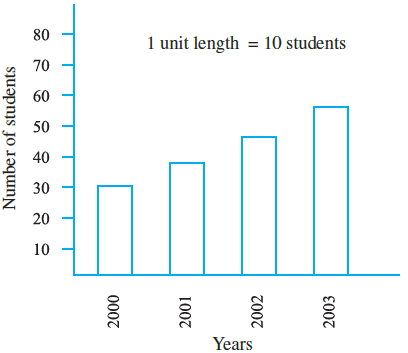
Answer the following questions :
(a) What is the scale of this graph?
(b) How many new students are added every year?
(c) Is the number of students in the year 2003 twice that in the year 2000?
Answer:
The answers are provided based on the data table given in the previous prompt.
Data from the table:
| Year | Number of Students |
| 2000 | 30 |
| 2001 | 35 |
| 2002 | 45 |
| 2003 | 55 |
(a) What is the scale of this graph?
This question refers to the visual bar graph. The scale is indicated on the vertical axis (y-axis). The markings are 0, 10, 20, 30, and so on, representing the number of students.
Therefore, the scale of the graph is 1 unit length = 10 students.
(b) How many new students are added every year?
We calculate the increase in the number of students each year using the table's data.
- Increase from 2000 to 2001 = $35 - 30 = 5$ students.
- Increase from 2001 to 2002 = $45 - 35 = 10$ students.
- Increase from 2002 to 2003 = $55 - 45 = 10$ students.
The number of new students added is not the same every year. 5 students were added in 2001, while 10 students were added in 2002 and 10 students in 2003.
(c) Is the number of students in the year 2003 twice that in the year 2000?
From the table:
Number of students in the year 2003 = 55.
Number of students in the year 2000 = 30.
Now, let's calculate twice the number of students from the year 2000:
Twice the students in 2000 = $2 \times 30 = 60$.
Since the number of students in 2003 (55) is not equal to 60, the statement is false.
No, the number of students in the year 2003 is not twice that in the year 2000.
Exercise 9.3
Question 1. The bar graph given alongside shows the amount of wheat purchased by government during the year 1998-2002.
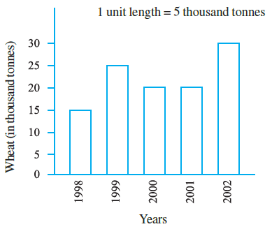
Read the bar graph and write down your observations. In which year was
(a) the wheat production maximum?
(b) the wheat production minimum?
Answer:
First, let's observe the bar graph and extract the data regarding wheat purchased by the government for each year. The vertical axis represents the amount of wheat in Thousand Tonnes, and the scale is 1 unit length = 5 thousand tonnes.
The data from the graph is as follows:
| Year | Wheat Purchased (in Thousand Tonnes) |
| 1998 | 15 |
| 1999 | 25 |
| 2000 | 20 |
| 2001 | 20 |
| 2002 | 30 |
(a) The wheat production maximum?
To find the year with the maximum wheat purchase (production is often used interchangeably in this context, assuming purchase reflects production trends), we look for the highest bar or the largest value in our table.
Comparing the values (15, 25, 20, 20, 30), the maximum value is 30 thousand tonnes.
This corresponds to the year 2002.
Therefore, the wheat purchase was maximum in the year 2002.
(b) The wheat production minimum?
To find the year with the minimum wheat purchase, we look for the shortest bar or the smallest value in our table.
Comparing the values (15, 25, 20, 20, 30), the minimum value is 15 thousand tonnes.
This corresponds to the year 1998.
Therefore, the wheat purchase was minimum in the year 1998.
Question 2. Observe this bar graph which is showing the sale of shirts in a ready made shop from Monday to Saturday.
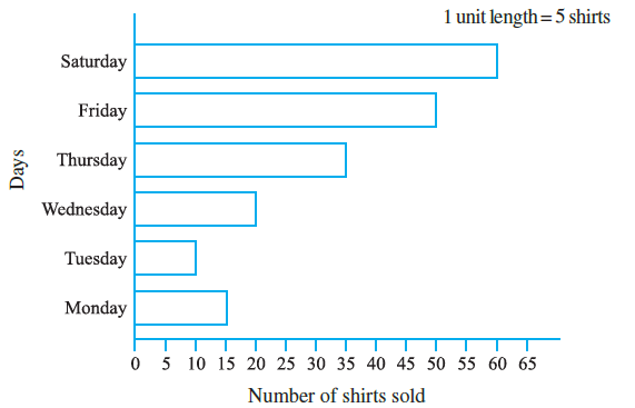
Now answer the following questions :
(a) What information does the above bar graph give?
(b) What is the scale chosen on the horizontal line representing number of shirts?
(c) On which day were the maximum number of shirts sold? How many shirts were sold on that day?
(d) On which day were the minimum number of shirts sold?
(e) How many shirts were sold on Thursday?
Answer:
First, let's read the data from the bar graph regarding the number of shirts sold each day.
| Day | Number of Shirts Sold |
| Monday | 15 |
| Tuesday | 10 |
| Wednesday | 20 |
| Thursday | 35 |
| Friday | 50 |
| Saturday | 60 |
(a) What information does the above bar graph give?
The bar graph shows the number of shirts sold in a ready-made shop on different days of the week, specifically from Monday to Saturday.
(b) What is the scale chosen on the horizontal line representing number of shirts?
The horizontal line (x-axis) represents the number of shirts. The markings are at intervals of 5 (0, 5, 10, 15, ...). One unit length along this axis represents 5 shirts.
Therefore, the scale chosen is 1 unit length = 5 shirts.
(c) On which day were the maximum number of shirts sold? How many shirts were sold on that day?
To find the maximum sales, we look for the longest bar or the highest value in our table (15, 10, 20, 35, 50, 60).
The maximum value is 60, which corresponds to Saturday.
Therefore, the maximum number of shirts were sold on Saturday, and 60 shirts were sold on that day.
(d) On which day were the minimum number of shirts sold?
To find the minimum sales, we look for the shortest bar or the lowest value in our table (15, 10, 20, 35, 50, 60).
The minimum value is 10, which corresponds to Tuesday.
Therefore, the minimum number of shirts were sold on Tuesday.
(e) How many shirts were sold on Thursday?
We locate the bar for Thursday and read its corresponding value on the horizontal axis.
The bar for Thursday extends to the mark 35.
Therefore, 35 shirts were sold on Thursday.
Question 3. Observe this bar graph which shows the marks obtained by Aziz in half-yearly examination in different subjects.
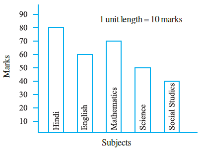
Answer the given questions.
(a) What information does the bar graph give?
(b) Name the subject in which Aziz scored maximum marks.
(c) Name the subject in which he has scored minimum marks.
(d) State the name of the subjects and marks obtained in each of them.
Answer:
First, let's read the marks obtained by Aziz in each subject from the bar graph. The vertical axis (y-axis) shows the marks, and the scale is 1 unit length = 10 marks.
(a) What information does the bar graph give?
The bar graph shows the marks obtained by Aziz in different subjects (Hindi, English, Mathematics, Science, Social Studies) in his half-yearly examination.
(b) Name the subject in which Aziz scored maximum marks.
To find the subject with maximum marks, we look for the tallest bar. The tallest bar corresponds to Hindi.
(Reading from the graph, the marks in Hindi are 80, which is the highest).
(c) Name the subject in which he has scored minimum marks.
To find the subject with minimum marks, we look for the shortest bar. The shortest bar corresponds to Social Studies.
(Reading from the graph, the marks in Social Studies are 40, which is the lowest).
(d) State the name of the subjects and marks obtained in each of them.
We read the height of each bar against the vertical scale to find the marks for each subject:
| Subject | Marks Obtained |
| Hindi | 80 |
| English | 60 |
| Mathematics | 70 |
| Science | 50 |
| Social Studies | 40 |
Example 10 (Before Exercise 9.4)
Example 10: Following table shows the monthly expenditure of Imran’s family on various items.
| Items | Expenditure (in $\textsf{₹}$) |
|---|---|
| House rent | 3000 |
| Food | 3400 |
| Education | 800 |
| Electricity | 400 |
| Transport | 600 |
| Miscellaneous | 1200 |
To represent this data in the form of a bar diagram, here are the steps.
(a) Draw two perpendicular lines, one vertical and one horizontal.
(b) Along the horizontal line, mark the ‘items’ and along the vertical line, mark the corresponding expenditure.
(c) Take bars of same width keeping uniform gap between them.
(d) Choose suitable scale along the vertical line. Let 1 unit length = 200 and then mark the corresponding values.
Answer:
To represent the given data in the form of a bar diagram, we follow the steps outlined in the question.
(a) Draw two perpendicular lines, one vertical and one horizontal.
We start by drawing two perpendicular lines. The horizontal line is called the x-axis, and the vertical line is called the y-axis. They intersect at the origin (0).
(b) Along the horizontal line, mark the ‘items’ and along the vertical line, mark the corresponding expenditure.
The different categories of spending, which are the 'Items' (House rent, Food, Education, etc.), will be shown on the horizontal x-axis. The numerical data, which is the 'Expenditure (in $\textsf{₹}$)', will be shown on the vertical y-axis.
(c) Take bars of same width keeping uniform gap between them.
For each item on the x-axis, we will draw a rectangular bar. To ensure the graph is accurate and easy to compare, all bars must have the same width, and the space between each bar must be uniform.
(d) Choose suitable scale along the vertical line. Let 1 unit length = $\textsf{₹}$ 200 and then mark the corresponding values.
The scale for the vertical axis is chosen as 1 unit = $\textsf{₹}$ 200. Based on this scale, we calculate the height of each bar:
Height of Bar (in units) = $\frac{\text{Expenditure}}{\text{200}}$
| Items | Expenditure (in $\textsf{₹}$) | Height of Bar (in units) |
| House Rent | 3000 | $3000 \div 200 = 15$ |
| Food | 3400 | $3400 \div 200 = 17$ |
| Education | 800 | $800 \div 200 = 4$ |
| Electricity | 400 | $400 \div 200 = 2$ |
| Transport | 600 | $600 \div 200 = 3$ |
| Miscellaneous | 1200 | $1200 \div 200 = 6$ |
The vertical axis will be marked with values 0, 200, 400, 600, ... up to 3400 or higher.
Final Bar Graph
Following all the steps above, the resulting bar graph is shown below:
Exercise 9.4
Question 1. A survey of 120 school students was done to find which activity they prefer to do in their free time.
| Preferred activity | Number of students |
|---|---|
| Playing | 45 |
| Reading story books | 30 |
| Watching TV | 20 |
| Listening to music | 10 |
| Painting | 15 |
Draw a bar graph to illustrate the above data taking scale of 1 unit length = 5 students.
Which activity is preferred by most of the students other than playing?
Answer:
1. Constructing the Bar Graph
To illustrate the data, we will create a bar graph with 'Preferred activity' on the horizontal axis and 'Number of students' on the vertical axis. The chosen scale is 1 unit length = 5 students.
Steps:
1. Draw and label the horizontal (Preferred activity) and vertical (Number of students) axes.
2. Mark the vertical axis using the scale of 5 students per unit (0, 5, 10, 15, ...).
3. Calculate the height of each bar:
- Playing: $45 \div 5 = 9$ units
- Reading story books: $30 \div 5 = 6$ units
- Watching TV: $20 \div 5 = 4$ units
- Listening to music: $10 \div 5 = 2$ units
- Painting: $15 \div 5 = 3$ units
4. Draw the bars with these heights, ensuring they have equal width and are uniformly spaced.
2. Answering the Question
Which activity is preferred by most of the students other than playing?
To answer this, we exclude "Playing" and compare the number of students for the remaining activities:
- Reading story books: 30 students
- Watching TV: 20 students
- Listening to music: 10 students
- Painting: 15 students
The highest number among these is 30, which corresponds to "Reading story books".
Therefore, Reading story books is the activity preferred by most students other than playing.
Question 2. The number of Mathematics books sold by a shopkeeper on six consecutive days is shown below :
| Days | Sunday | Monday | Tuesday | Wednesday | Thursday | Friday |
| Number of books sold | 65 | 40 | 30 | 50 | 20 | 70 |
Draw a bar graph to represent the above information choosing the scale of your choice.
Answer:
1. Constructing the Bar Graph
To represent this data, we will draw a bar graph. First, we need to choose a suitable scale for the number of books sold.
Choosing a Scale: The data values range from 20 to 70. A convenient scale would be 1 unit length = 10 books. This scale is easy to work with and clearly represents all the data points.
Steps:
1. Draw and label the horizontal axis ('Days') and the vertical axis ('Number of books sold').
2. Mark the vertical axis using the chosen scale of 10 books per unit (0, 10, 20, ...).
3. Calculate the height of each bar:
- Sunday: $65 \div 10 = 6.5$ units
- Monday: $40 \div 10 = 4$ units
- Tuesday: $30 \div 10 = 3$ units
- Wednesday: $50 \div 10 = 5$ units
- Thursday: $20 \div 10 = 2$ units
- Friday: $70 \div 10 = 7$ units
4. Draw bars of equal width and uniform spacing corresponding to these heights.
Question 3. Following table shows the number of bicycles manufactured in a factory during the years 1998 to 2002. Illustrate this data using a bar graph. Choose a scale of your choice.
| Years | Number of bicycles manufactured |
|---|---|
| 1998 | 800 |
| 1999 | 600 |
| 2000 | 900 |
| 2001 | 1100 |
| 2002 | 1200 |
(a) In which year were the maximum number of bicycles manufactured?
(b) In which year were the minimum number of bicycles manufactured?
Answer:
1. Constructing the Bar Graph
To illustrate this data, we will create a bar graph with 'Years' on the horizontal axis and 'Number of bicycles manufactured' on the vertical axis.
Choosing a Scale: The data values are large, ranging from 600 to 1200. A suitable scale is 1 unit length = 100 bicycles.
Steps:
1. Draw and label the axes.
2. Mark the vertical axis using the scale of 100 bicycles per unit (0, 100, 200, ...).
3. Calculate the height of each bar:
- 1998: $800 \div 100 = 8$ units
- 1999: $600 \div 100 = 6$ units
- 2000: $900 \div 100 = 9$ units
- 2001: $1100 \div 100 = 11$ units
- 2002: $1200 \div 100 = 12$ units
4. Draw the bars with these heights, keeping their widths and the gaps between them uniform.
2. Answering the Questions
(a) In which year were the maximum number of bicycles manufactured?
By observing the data table or the tallest bar on the graph, the maximum number is 1200. This occurred in the year 2002.
(b) In which year were the minimum number of bicycles manufactured?
By observing the data table or the shortest bar on the graph, the minimum number is 600. This occurred in the year 1999.
Question 4. Number of persons in various age groups in a town is given in the following table.
|
Age group (in years) |
1-14 | 15-29 | 30-44 | 45-59 | 60-74 | 75 and above |
| Number of persons | 2 lakhs | 1 lakh 60 thousands | 1 lakh 20 thousands | 1 lakh 20 thousands | 80 thousands | 40 thousands |
Draw a bar graph to represent the above information and answer the following questions. (take 1 unit length = 20 thousands)
(a) Which two age groups have same population?
(b) All persons in the age group of 60 and above are called senior citizens. How many senior citizens are there in the town?
Answer:
1. Preparing the Data and Constructing the Bar Graph
First, we convert all population figures to a common unit, 'thousands', for easier plotting.
- 1-14: 2 lakhs = 200 thousands
- 15-29: 1 lakh 60 thousands = 160 thousands
- 30-44: 1 lakh 20 thousands = 120 thousands
- 45-59: 1 lakh 20 thousands = 120 thousands
- 60-74: 80 thousands
- 75 and above: 40 thousands
The scale is given as 1 unit length = 20 thousands.
Bar Heights (in units):
- 1-14: $200 \div 20 = 10$ units
- 15-29: $160 \div 20 = 8$ units
- 30-44: $120 \div 20 = 6$ units
- 45-59: $120 \div 20 = 6$ units
- 60-74: $80 \div 20 = 4$ units
- 75 and above: $40 \div 20 = 2$ units
2. Answering the Questions
(a) Which two age groups have same population?
Looking at the data table or the bar graph, we can see two bars of the same height. These correspond to the age groups with the same population.
The age groups 30-44 and 45-59 both have a population of 1 lakh 20 thousands.
(b) All persons in the age group of 60 and above are called senior citizens. How many senior citizens are there in the town?
To find the total number of senior citizens, we need to add the populations of the age groups '60-74' and '75 and above'.
Population of '60-74' age group = 80 thousands
Population of '75 and above' age group = 40 thousands
Total number of senior citizens = 80,000 + 40,000 = 120,000.
In the given format, this is 1 lakh 20 thousands.
